How to Compare Players by Position Using Analytics
5-step framework to compare players by position with position-specific metrics, normalization, clustering, and radar charts.
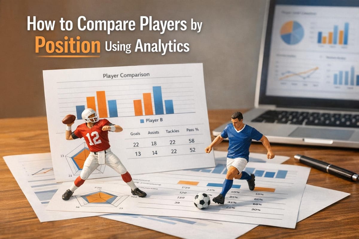
Comparing players across positions requires a tailored approach. Each role in sports has unique demands, so using the same metrics for all players often leads to inaccurate evaluations. Modern analytics solve this by focusing on position-specific metrics, ensuring fair comparisons and deeper insights into performance.
Key Takeaways:
- Position-Specific Metrics: Metrics like Well-Thrown Percentage (WTN%) for quarterbacks or Burn Percentage for wide receivers provide more accurate evaluations than general stats.
- Advanced Systems: Tools like StatPro and PFF track detailed data, such as separation stats in football, to assess players beyond basic outcomes.
- Data Normalization: Adjusting stats for factors like possession or playing time ensures fair comparisons across players and teams.
- Visualization Tools: Radar charts and percentile rankings make complex data easier to interpret, highlighting strengths and weaknesses quickly.
By focusing on these steps, you can analyze players more effectively, whether for drafting, fantasy sports, or casual debates.
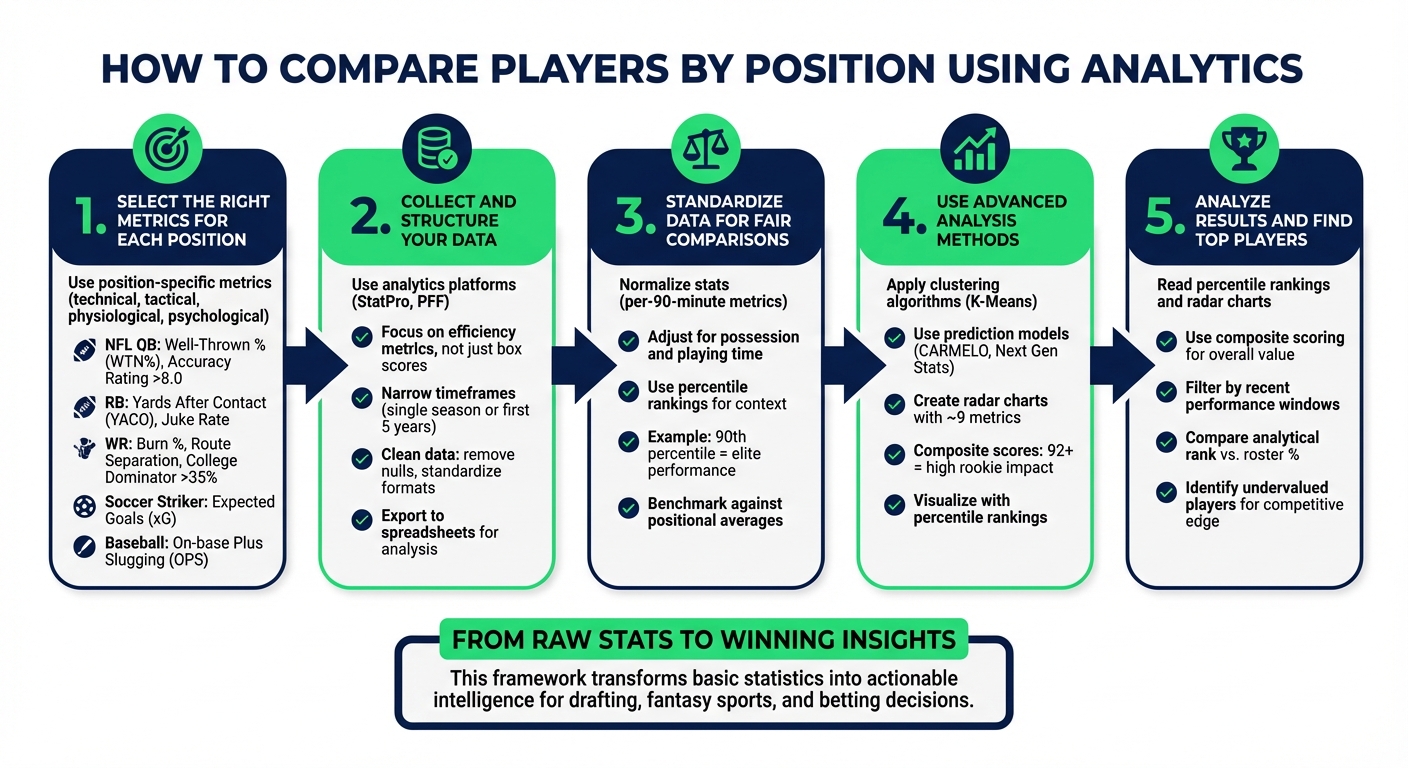
5-Step Framework for Comparing Players Using Position-Specific Analytics
How To Compare MLB Players With Statistics? - The Friendly Statistician
Step 1: Select the Right Metrics for Each Position
Using the same metrics across all positions leads to skewed results; each role demands its own specific measurements.
Metrics can be divided into four categories: technical, tactical, physiological, and psychological. The importance of these metrics varies depending on the position. For example, a soccer goalkeeper requires a completely different set of performance indicators than a striker, even though both play crucial roles in the team's success.
Position-Specific Metric Examples
Here’s a breakdown of key metrics by position:
NFL quarterbacks are best evaluated using metrics like Well-Thrown Percentage (WTN%), which measures throw accuracy regardless of whether the pass is caught. This provides a clearer picture of a quarterback's skill than completion percentage, which can be misleading due to short, easy throws. Elite quarterbacks typically maintain an Accuracy Rating above 8.0 on a 1-10 scale, while ratings below 7.0 indicate accuracy issues.
Running backs require a different set of metrics. Yards After Contact (YACO) highlights their strength and ability to break tackles. True Yards Per Carry, on the other hand, removes the impact of long, breakaway runs to give a more accurate measure of consistency. Metrics like Juke Rate and Yards Created provide insight into their elusiveness - qualities that traditional rushing stats often overlook.
Wide receivers stand out with metrics like Burn Percentage, which measures how often they win matchups when targeted. To dig deeper, Route Separation and Target Separation reveal how effectively receivers get open, even when they aren’t targeted. A College Dominator Rating of 35% or higher is a strong indicator of a receiver with WR1 potential.
In baseball, on-base plus slugging (OPS) remains the go-to metric for evaluating batters, as it combines their ability to get on base with their power hitting. For soccer strikers, Expected Goals (xG) uses data from nearly 1,000,000 historical shots to estimate scoring probability on a scale of 0 to 1. Meanwhile, midfielders are analyzed through metrics like pass completion rates and the number of passes into key zones.
| Sport | Position | Key Performance Metrics |
|---|---|---|
| NFL | Quarterback | Well-Thrown % (WTN%), Adjusted Yards Per Attempt, Pocket Time, Danger Plays |
| NFL | Running Back | Juke Rate, Yards Created, Yards After Contact (YACO), Opportunity Share |
| NFL | Wide Receiver | Target Share, Air Yards, Burn %, Catch Radius, Route Participation |
| Soccer | Striker | Expected Goals (xG), Shot-to-Goal Scoring Rate, Shots on Target |
| Soccer | Midfielder | Pass Completion Rate, Passes into Key Zones, Possession Turnovers Won |
Finding Metrics with StatPro
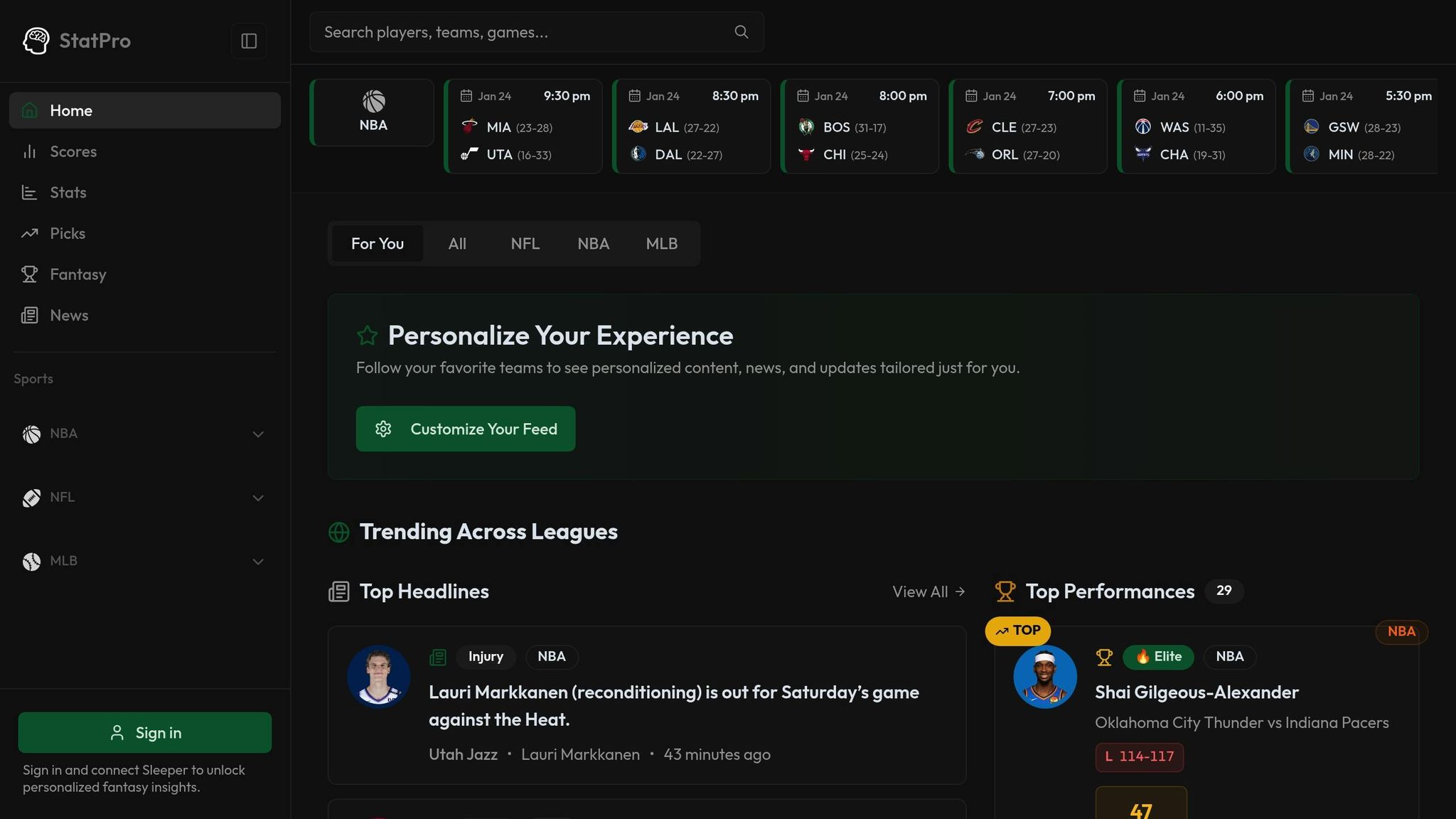
StatPro offers real-time data and advanced analytics across the NFL, NBA, and MLB, providing instant access to position-specific metrics as games progress. The platform tracks everything from quarterback pressure rates to wide receiver separation, streamlining the process and eliminating the need to pull data from multiple sources.
What makes modern analytics platforms like StatPro stand out is their ability to uncover efficiency metrics that traditional box scores miss. For example, Production Premium evaluates a player's efficiency by comparing their performance to league averages in identical game situations - factoring in down, distance, and yard line. This helps identify players who excel regardless of circumstances versus those who benefit from favorable conditions.
Now that the right metrics are identified, the next step is to gather and structure your data for deeper analysis.
Step 2: Collect and Structure Your Data
Getting Data from Analytics Platforms
After identifying the metrics you need, it’s time to dive into collecting detailed efficiency data. A great tool to consider is StatPro's Pro plan, which costs $9.99 per month. It offers real-time stats, rankings, and advanced analytics for leagues like the NFL, NBA, and MLB. Instead of juggling multiple sources, StatPro consolidates everything in one place, including real-time injury updates and transaction news - critical factors for evaluating players effectively.
Focus on advanced efficiency metrics, not just basic box score numbers. For example, StatPro's "Top Performances" feed highlights standout statistical performances by position, making it easier to pinpoint high-impact players.
When gathering data, narrow your focus to specific timeframes - like a player's first five years or a single season - rather than relying on career totals. This approach helps uncover trends and development patterns, offering more insightful comparisons. Also, note that some advanced comparison tools work best on a desktop interface, so using a laptop instead of a mobile app is recommended for building complex reports.
Once your data is collected, the next step is organizing it for analysis.
Setting Up Your Data for Analysis
Start by importing raw data without making any changes. This ensures you maintain an accurate audit trail. Next, clean up the data by addressing null values, removing extra spaces, and standardizing inconsistencies like variations in team names or player positions.
Make sure text fields, such as dates, are in the correct format, and double-check that numeric data is properly categorized. For more in-depth analysis, export your cleaned and organized data into spreadsheets. This structured data becomes the backbone for the benchmarking and standardization steps that come next.
Step 3: Standardize Data for Fair Comparisons
How to Normalize Player Statistics
Raw stats can often paint a misleading picture. For example, 9 interceptions with 40% team possession is not the same as 7 interceptions with 60% possession. Adjusting both to a 50% possession basis gives a clearer comparison: 7.5 versus 8.75 interceptions.
To ensure fairness when comparing players, convert seasonal totals into per-90-minute metrics. This levels the playing field between starters and rotation players. However, defensive stats need an extra layer of adjustment for possession. As Footballytics explains:
"Unadjusted defensive quantitative values (p90) favor players from teams with little possession, as they had more time to execute their defensive actions".
Offensive metrics require a different kind of normalization. Context is key here - metrics like "Expected Assists per 40 passes" or "Progressive Runs per 30 touches" can highlight how players perform relative to their involvement in play. Take Marco Verratti from PSG, for instance. He averages 90 touches per game on a team with over 60% possession. Compare that to Jean Onana, who averages just 47 touches on a team with 48% possession. Without normalization, such comparisons would be skewed.
Once your data is normalized, the next step is establishing benchmarks to evaluate performance effectively.
Creating Benchmarks for Player Evaluation
Percentile rankings are a powerful way to contextualize performance. A player with 2.1 tackles per 90 minutes might not stand out - until you realize they’re in the 90th percentile among their peers.
Another approach is to benchmark against positional averages. For example, center forwards naturally score more often because they operate closer to goal. Analytics tools can help refine benchmarks by filtering for specific positions. You can also create more tailored benchmarks by segmenting data by age, performance level, or playing style to ensure evaluations are relevant to the player's context.
Finally, decide what type of benchmark best suits your analysis. Will you compare players to internal team standards, positional norms, or league-specific metrics? Each approach offers unique insights depending on your analytical goals.
Step 4: Use Advanced Analysis Methods
Using Clustering and Prediction Models
Once your data is standardized and position-specific, advanced analysis methods can uncover patterns you might miss with raw numbers. Clustering algorithms, like K-Means, are especially useful for grouping players based on statistical similarities. These groupings can highlight performance tiers within the same position that aren't immediately obvious.
To ensure fairness in your analysis, standardize metrics using z-scores. This prevents variables with larger scales from overshadowing others. After that, determine the ideal number of clusters using techniques like the Elbow Method (which identifies where variance reduction levels off), the Silhouette Method (which measures how well data points fit within their clusters), or the Gap Statistic.
A great example of clustering in action comes from Allen Chun's October 2023 analysis of 172 NBA players. Using K-Means, he divided them into eight distinct groups based on 42 on-court metrics. The algorithm identified functional roles like "All-Around Superstars" (e.g., Giannis Antetokounmpo), "Non-Shooting Centers" (e.g., Clint Capela), and "Shot-Creating First Options" (e.g., Stephen Curry).
Prediction models take things a step further by forecasting future performance. For instance, FiveThirtyEight's CARMELO system uses historical player data to match current players with statistical doppelgängers, projecting their career trajectories based on how those comparisons performed. Similarly, the Next Gen Stats Draft Model evaluates prospects using composite scores between 50 and 99. In the 2019 NFL Draft, every player scoring 92 or above started at least four games as a rookie. Adding visualizations to these models makes insights easier to interpret and apply.
Creating Visual Comparisons
Visual tools like radar charts (also called spider or pizza charts) can make complex data more digestible. Instead of overwhelming users with rows of numbers, radar charts turn metrics into shapes that are easier to grasp at a glance.
When creating radar charts, use percentile rankings rather than raw totals. For example, Bukayo Saka's 2.1 chances created per 90 minutes during the 2022–23 season placed him in the 92nd percentile among forwards, based on 15 years of data from Europe's top leagues. Keep the chart focused by limiting it to about nine metrics. This approach ensures viewers can process the information quickly - within the "five-second window" that most graphics get on screen. Group related metrics together, such as defensive actions, attacking contributions, and ball progression, while avoiding redundant stats like total touches and total passes. Tools like StatPro's analytics software can help you create templates tailored to specific roles, such as center backs, strikers, or midfielders, ensuring comparisons highlight the metrics that matter most.
Step 5: Analyze Results and Find Top Players
Reading Player Rankings
Once you’ve compiled standardized, position-specific data, the next step is diving into the analysis to identify standout players. Percentile rankings are key to understanding how a player measures up against their peers. Take a radar chart, for example: the further a slice extends from the center, the higher the player’s percentile for that specific metric compared to others in the same position. A well-rounded radar shape often signals a balanced top performer, while sharp spikes highlight areas of elite specialization.
Composite scoring simplifies the evaluation process by combining key metrics into a single, actionable score. For instance, threshold analysis ensures players meet critical position-specific benchmarks - like a running back needing the right mix of speed and size. In baseball, value-based metrics such as "Dollar" values translate a player’s overall contributions into a single monetary figure. As of January 24, 2026, FanGraphs' Player Rater ranked Aaron Judge as the top outfielder with a Dollar value of $47.2, reflecting his .331 batting average and 53 home runs. Shohei Ohtani followed with a Dollar value of $42.2. These standardized formats make it easier to compare players across positions.
You can also filter rankings by recent performance windows to pinpoint players on the rise. Advanced metrics like Burn % or Well-Thrown % uncover hidden gems - players whose value might not be obvious in traditional box scores. Tools like StatPro offer real-time position-specific rankings, helping you monitor performance shifts throughout the season. This step also validates the relevance of the metrics you chose back in Step 1, ensuring your analysis is grounded in meaningful data. These scores provide the foundation for informed decisions, whether you're drafting, managing a fantasy team, or placing bets.
Applying Insights to Your Decisions
Armed with these rankings and metrics, you can fine-tune your strategies. For drafting, prioritize players with composite scores of 90 or higher - this is a proven indicator of immediate impact. In fantasy football, compare percentile rankings for stats like rushing yards or receptions to determine which player offers the best upside for specific matchups.
Similarity scores are another powerful tool, helping you identify comparable replacements if your top choice isn’t available. When it comes to betting, focus on efficiency metrics that isolate individual performance from team outcomes. For example, a quarterback with a high Well-Thrown % or a receiver with an impressive Burn % might be undervalued by traditional stats.
Finally, compare a player’s analytical rank to their "Start %" or "Roster %" to spot undervalued talent. If a player scores highly in your analysis but has a low roster percentage, they’re likely being overlooked by others. This gap between performance data and public perception can give you a competitive edge, whether you’re dominating your fantasy league or making smart bets.
Conclusion
Analyzing players by position through analytics can be a game-changer. By focusing on the right metrics, organizing reliable data, standardizing performance measures, and leveraging advanced tools, raw statistics turn into meaningful insights. Position-specific models and percentile rankings help zero in on what truly matters.
Recent advancements, like those from Next Gen Stats, highlight how predictive modeling cuts through the noise to pinpoint the stats that actually influence success.
"The trick is separating the signal (the inputs that are relevant to a player's likelihood of achieving NFL success) from the noise (those inputs with minimal predictive power)." - Next Gen Stats Analytics Team
This ability to distinguish between meaningful data and distractions is what enables platforms like StatPro to provide real-time, actionable insights.
Our five-step framework simplifies effective player comparisons. StatPro brings these tools to your fingertips. With real-time stats, detailed performance insights, and analytics for leagues like the NFL, NBA, and MLB, you gain access to the same data that pro teams rely on - no advanced degree required. Features like radar charts give you a quick, five-second snapshot of a player's style, while automated reports eliminate hours of manual work.
Whether you're managing a fantasy team, making bets, or settling a friendly argument, analytics give you an edge. The rise of visual learning and self-guided analytics means you now have access to decades of benchmark data. What was once exclusive to professional front offices is now available to you. Use these insights to make sharper, smarter decisions starting today.
FAQs
Why are position-specific metrics important for analyzing players?
Position-specific metrics are crucial because they zero in on the unique demands of each player's role, offering a more precise way to assess performance. Instead of leaning on broad, one-size-fits-all stats, these metrics focus on what truly matters for each position - like route running for wide receivers or pass rushing for defensive linemen.
This tailored approach makes player comparisons much more meaningful by considering the specific responsibilities tied to their roles. It also helps identify overlooked talent, giving teams an edge in scouting, coaching, and player development. In the end, using position-specific analytics leads to smarter decisions and stronger team performance.
How does data normalization help compare players fairly?
Data normalization helps create fair comparisons between players by adjusting raw performance metrics to account for variables like playing time, team strategies, or game conditions. Raw stats - such as total yards, completed passes, or tackles - can sometimes be misleading because they lack the context of how those numbers were achieved.
Through statistical techniques, normalization standardizes data, making it possible to evaluate players on equal footing. For instance, metrics like passing accuracy or defensive actions can be adjusted to reflect how a player performs compared to the average, regardless of team dynamics or specific game scenarios. This approach enables analysts, coaches, and fans to make assessments that are not only more accurate but also more meaningful.
How do radar charts help in evaluating players by position?
Radar charts, often called spider charts, are a handy way to visualize and compare players by showcasing multiple performance metrics in one graphic. They create a shape that reflects a player's strengths and weaknesses across different areas, making it easier to grasp their overall profile at a glance.
These charts shine when comparing players in the same position, helping analysts and coaches identify patterns or trends in performance quickly. While they do have some drawbacks - like the potential for scale misinterpretation - they remain a key tool in sports analytics for turning complex data into clear, actionable visuals.